-
Links
- CAFKA home page
-
Our Contributions
- Development
- Systems
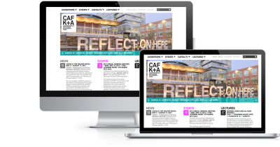
Woolwich Web works was contracted to work on the development of a new CAFKA website in 2011. Since then, we have worked with CAFKA to implement design changes and provide technical support and updates to the site.
There are a few interesting things about this site. One is the unique colour application for each section. This was implemented using the context module, which allows you to define "sections" of a site based on various factors, and then do various things in those contexts. Here, we have defined a context for each section and changed the title and header colours for each.
Another interesting problem was the navigation in the Exhibitions section (see top screenshot at right). Within an exhibition, artists are listed in a paged view, with three artists listed per page. The navigation on the right lists all the artists in an exhibtion. It was a challenge to set up the navigation so that the link would point to the artists listing where it appeared in the paged navigation.
A new home page was developed in September, 2012 to bring more of the site's content to the forefront.
Overall this is a relatively simple looking site with a lot of interesting development problems "under the hood". As a non-profit, CAFKA's resources are limited and we continue to work with them to solve problems within their budget. CAFKA is working to obtain funding to make the site mobile friendly and improve user engagement in 2018.
Design by Muuz
